TolkApp

Brand Identity
Copywriting
App Design
UX / UI Design
Art Direction

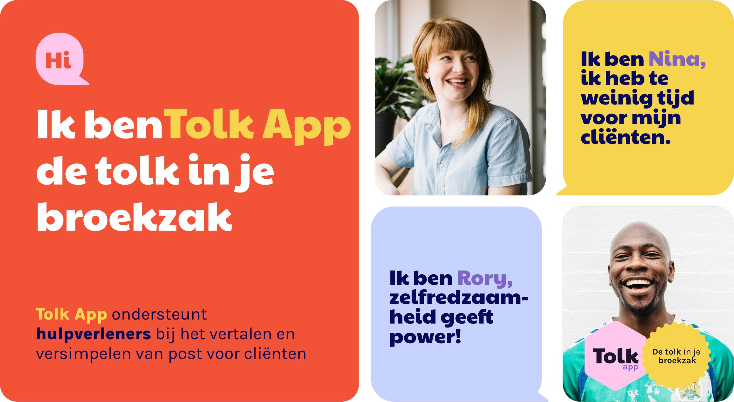
Creating a brand that speaks to both aid workers and their clients

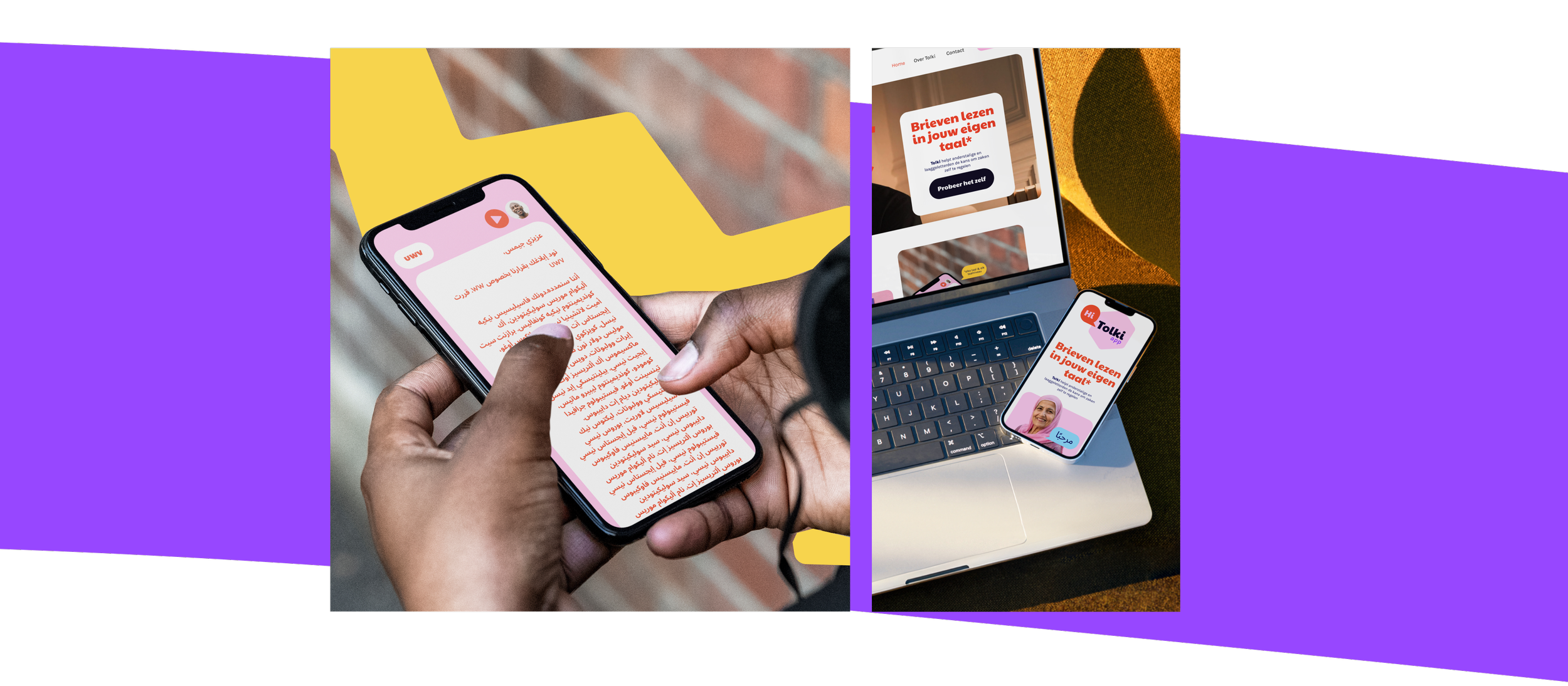
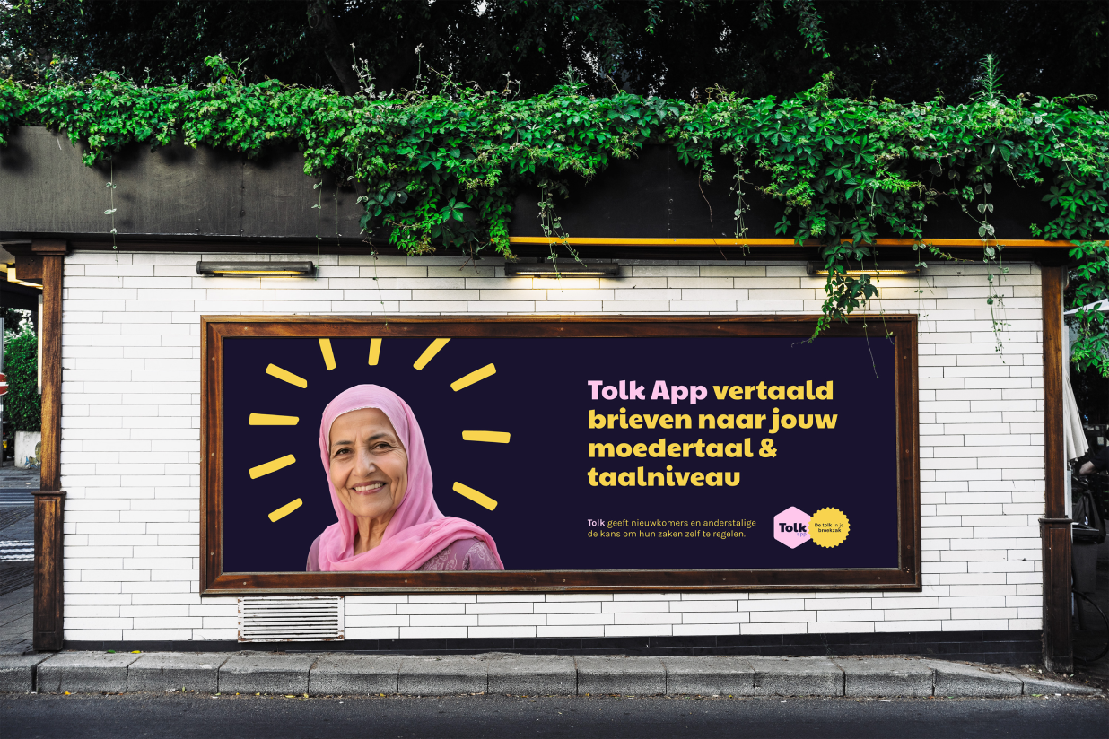
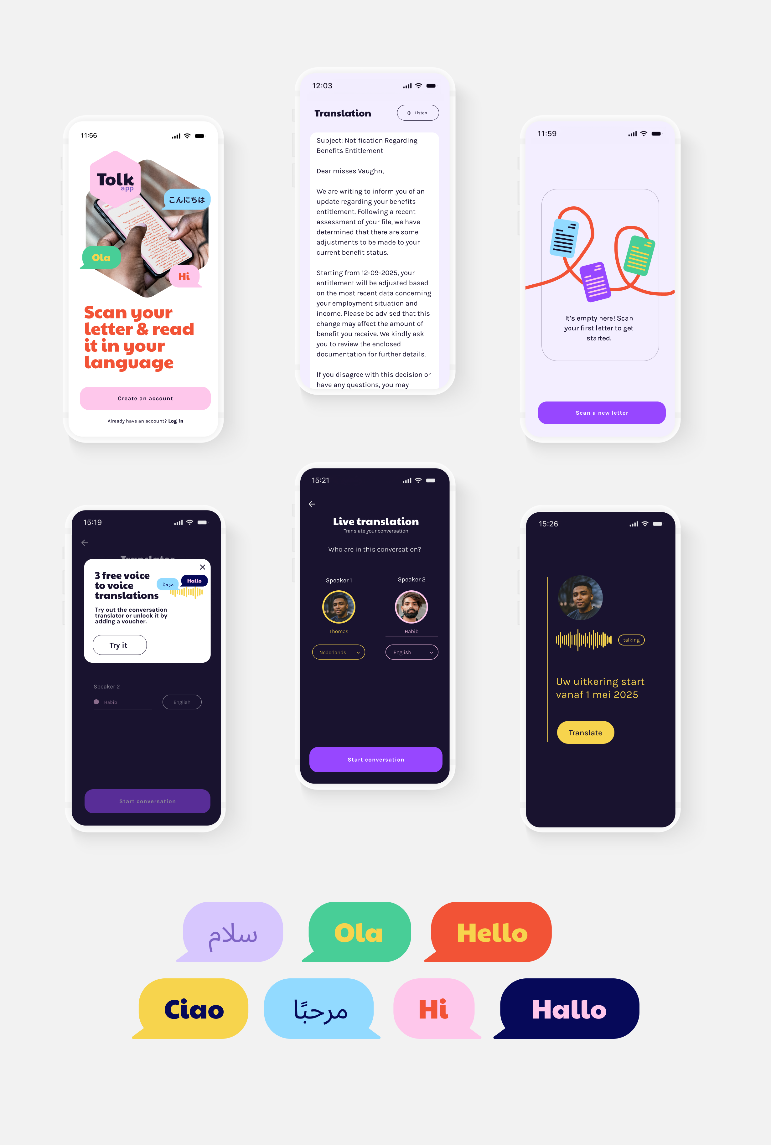
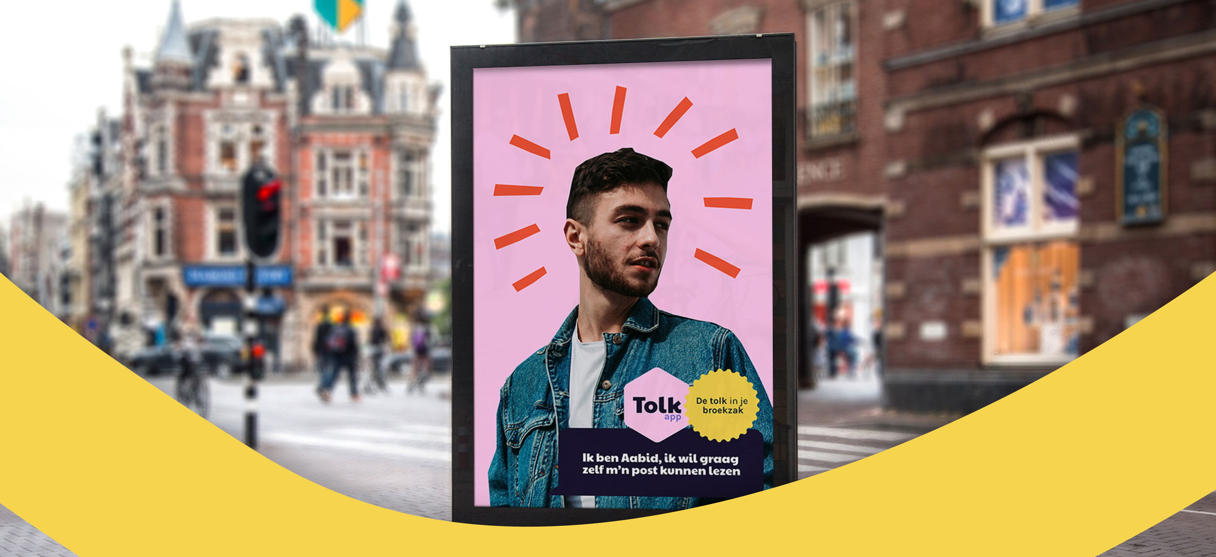
TolkApp was created to make communication clear for everyone. In the Netherlands, millions of (multilingual) residents struggle with reading, writing, or understanding complex language. TolkApp translates, simplifies, and clarifies documents instantly.

We created a brand and digital experience that speaks to two very different audiences: aid workers and their clients. Our work brought the product’s purpose to the surface: communication that feels accessible, human, and trustworthy.

Collage of digital devices with language learning content: a hand holding a smartphone displaying a language app with Arabic text, a laptop showing a language learning website, and a smartphone on the laptop keyboard with a video call screen in a purple and yellow abstract background.
Billboard on a brick wall featuring a smiling woman in a pink headscarf with a halo-like yellow design around her head. The billboard promotes the Tolk App, which translates letters to the user's native language and level. The background is purple, and the text is in Dutch.
Collection of mobile app screens demonstrating language translation and speech recognition features, with colorful speech bubbles showing greetings in different languages such as Hello, Hi, Ciao, Ola, مرحبا, سلام, and Hallo.
Street advertisement featuring a young man with a beard wearing a denim jacket, with graphic red lines radiating from his head, and text in Dutch about a translation app called Tolk.
A colorful promotional image for Tolk App, which supports help interpreters translating and simplifying posts for clients. It features three sections with text and pictures, including a woman smiling, a man with a big smile, and speech bubbles with text in Dutch.